Client
Ruoska
Year
2025
Category
Logo Design
Where Blackletter Meets Bass
Aino Valkama, AKA Ruoska (meaning “whip” in Finnish), is a Finland-based DJ who launched their brand in 2024. Their genre-bending approach combines Drum & Bass, House, and UK Garage. Ruoska performs in a wide variety of settings, including underground raves, student parties, corporate functions, and other events. Their experimental take on blending different styles results in surprising and distinctive outcomes. Think: Brazilian Baile funk combined with pop classics.
Process
The initial idea for the logo was to combine an illustration of a whip and the word “Ruoska” as separate elements. Different compositions and font styles were experimented with, such as futuristic fonts and enclosed boxes, but the designs felt stiff.
Aino came across a flowy blackletter-style typeface, which sparked inspiration toward a new direction: a logotype in which all letters were slightly different and organic. The flowiness of the letters was used for good, and the serifs of the letters were shaped to mimic the waving strands of a whip
Starting Point
As a fresh brand in the DJ world, Ruoska was in need of a logo to make their brand distinct and memorable. I collaborated with Aino in 2025 to design a logo for the brand, “Ruoska.”
Inspiration for the logo was taken from vintage illustrations, especially those with inky and grainy textures. As the goal of the logo was to resemble an inky texture, I found it important to begin the initial ideation by hand and with actual ink.
Inspiration was also taken from an experimental typeface I developed in 2025 called “Nubben.” The style is inspired by Blackletter and the art of Finn-Swede artist Lars-Gunnar Nordström.
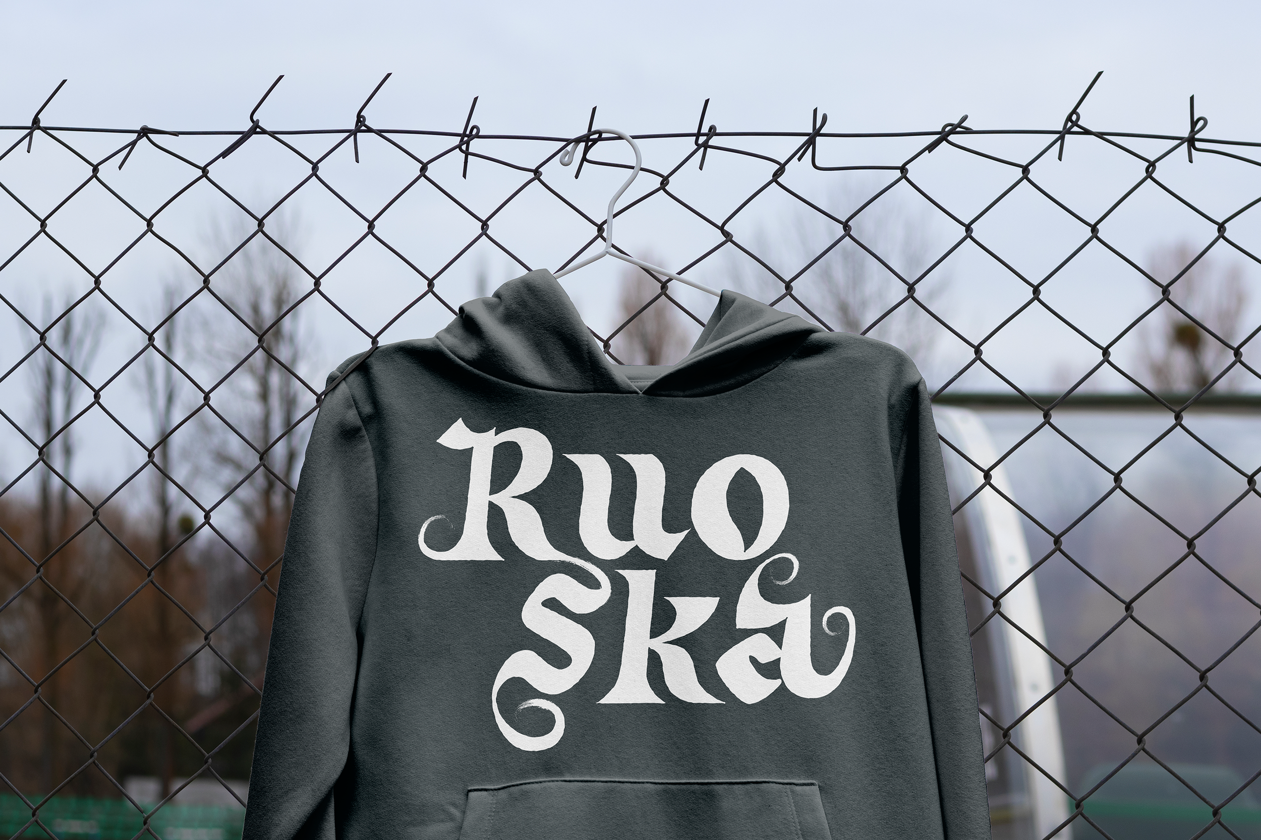
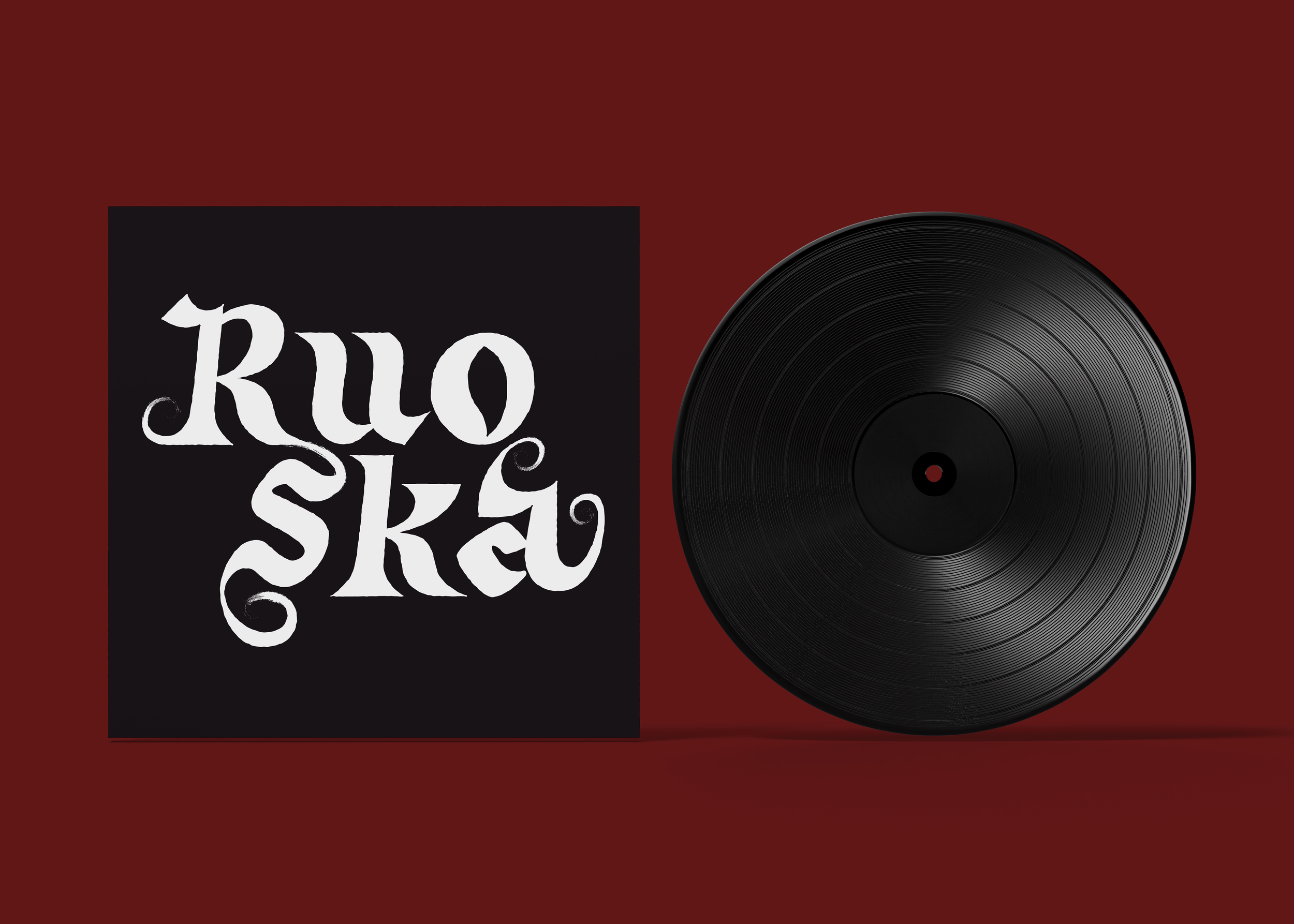
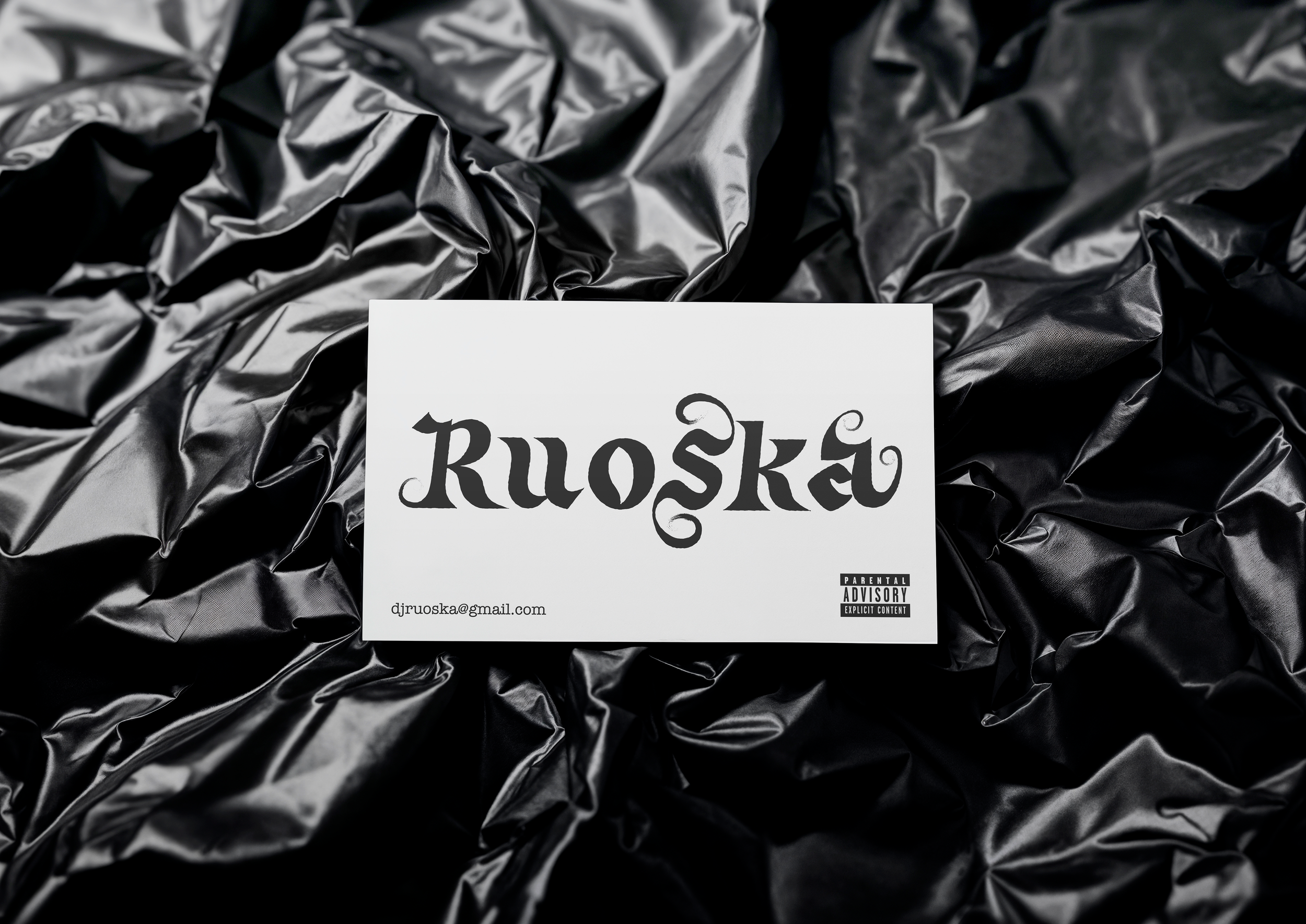
Result
The result is a logotype written in a hybrid blackletter typeface. The inky, curling flourishes narrate the form and movement of a whip. The logo comes in both horizontal and stacked formats, ensuring the brand stays legible across different formats and sizes