Helsingin Farkkuvarastomyynti
Helsingin Farkkuvarastomyynti is a family owned denim warehouse located in Helsinki, Finland. The business has been bustling with old and new customers since 1965. The business is currently run by my mother and grandmother. I do part-time work as a cashier and and take images for social media.
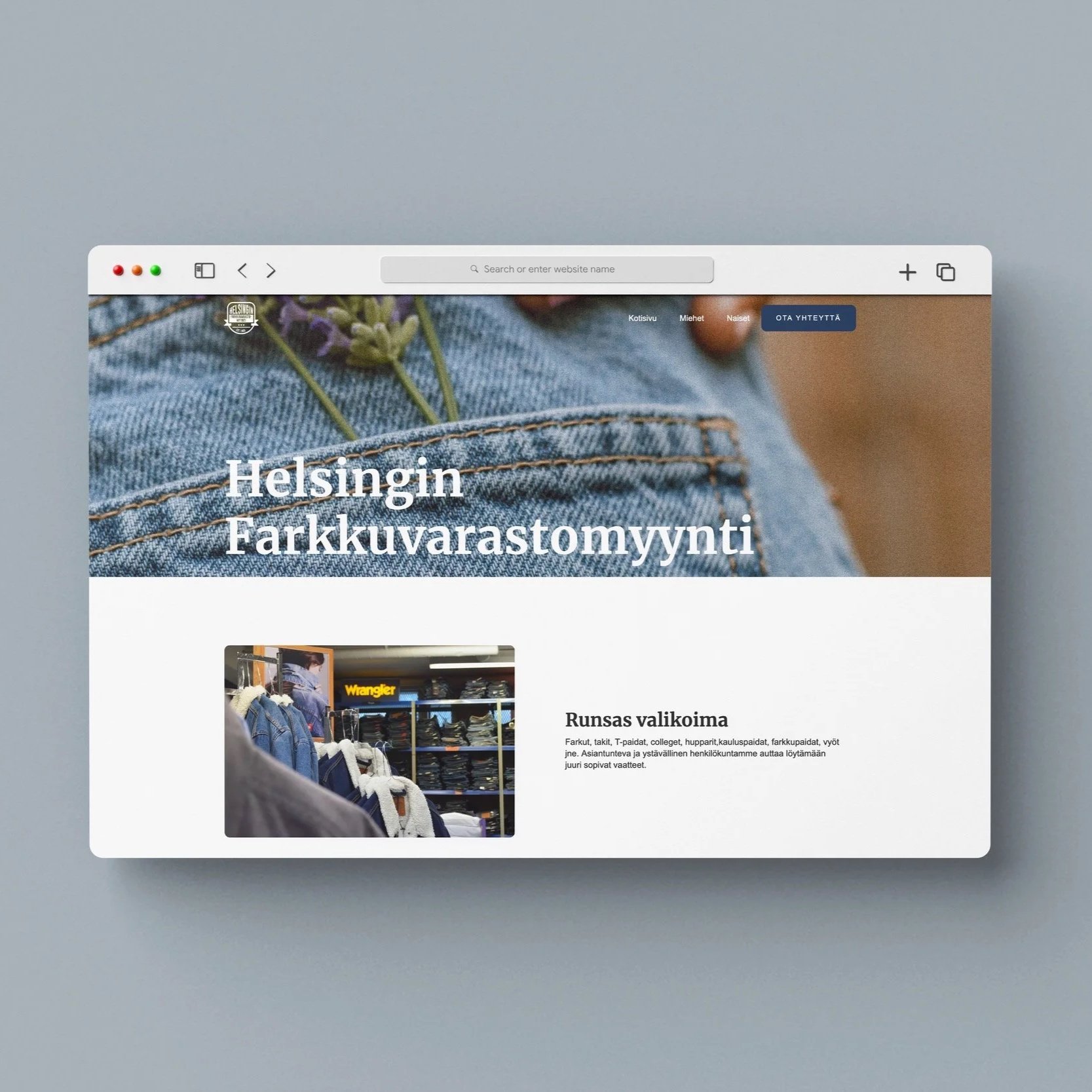
I have designed Helsinki Farkkuvarastomyynti’s logo, visual identity and website. I found it important for the visual identity to feel new, but still have a sense of authenticity and heritage. The shape language and logo is inspired by denim labels and vintage graphic design. The brand colors signify shades of denim.
When you walk into the store, you are surrounded by stacks of denim in every shade of blue imaginable. I wanted to illustrate the same feeling through the screen.

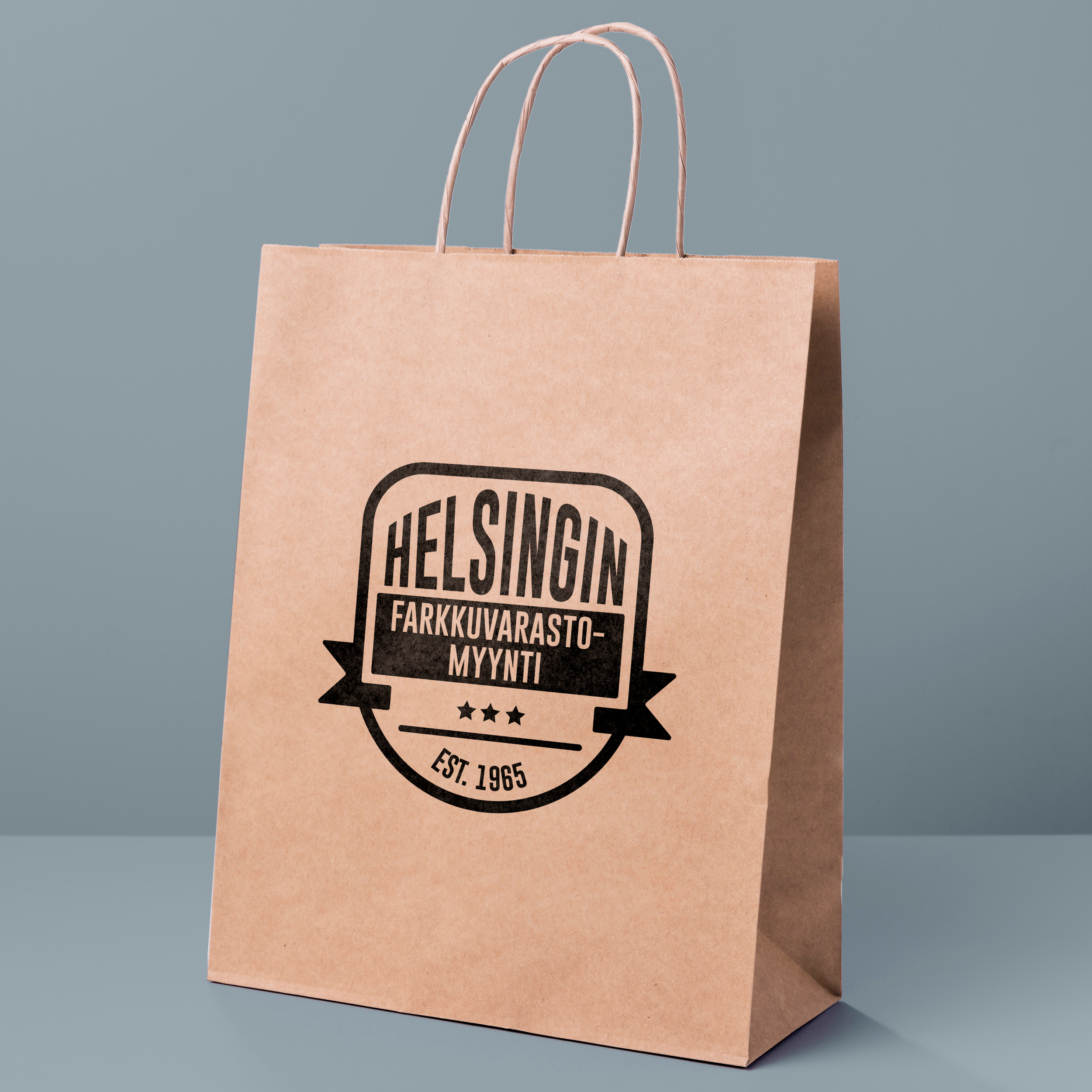
Logo
The goal for Helsinki Farkkuvarastomyynti’s logo was to create something vintage with a modern twist. I asked my mother and grandmother to describe the brand identity in single words: “Strong,” “family” and “sisu” were the most memorable ones. “Sisu” is a Finnish word, which signifies determination and persistence. These words guided my thoughts into a certain direction and I dove deeper into visual symbolism.
The shape of the logo is inspired by vintage denim labels, stamps and pockets. The font and stroke is strong and bold to ease legibility and feel modern. The layout is symmetric and centralised to portray stability. The three stars on the bottom symbolise family and excellence. I designed the logo in black and white as it works best with most materials and surfaces, such as paper bags and windows.

Digitalisation
Due to the sudden outbreak of Covid-19 in 2019, Helsingin Farkkuvarastomyynti had to rethink its business plan. As the business has supported itself through word of mouth and regular customers, it’s social media presence was almost nonexistent. As restrictions rose and sales fell rapidly, the thought of moving into the digital world came into question for the first time.
Instagram and Facebook were set up for marketing and I began working on the website. Helsinki Farkkuvarastomyynti’s name and logo gained familiarity through it’s social media profile and posts. We began communicating with customers via Facebook messenger and delivered denim from door to door
Helsingin Farkkuvarastomyynti had a previous website, but the visuals and information were outdated. The website wasn’t of much use, other than displaying the phone number and address of the store. On top of that, most information and recognition passed from customer to customer.
The goal for the website was to strengthen the brand identity of Helsingin Farkkuvarastomyynti and reach new customers. The information was to be easily accessible and understandable, while being aesthetically uniform. Further plans for the website is to display the available denim styles, brands, sizing and colors. This way the customer can stay on track on what is available.
Most questions regarding these factors are asked by phone. It can be difficult to grasp what color or style of denim the client is looking for without visual guides. The situation usually ends up in a seller running back and forth from landline to the shelves. The website would ease the mind of the customer and sellers. It would also save time, as customers would have an idea of what they are looking for when arriving.