Client
Aalto Management Consulting Association
Year
2021
Category
Visual Identity Design
Building Consulting Skills in University
Aalto Management Consulting Association (AMCA) brings together students of Aalto University with interest in consulting. The association hosts workshops and seminars, collaborating with experts in the industry of consulting.
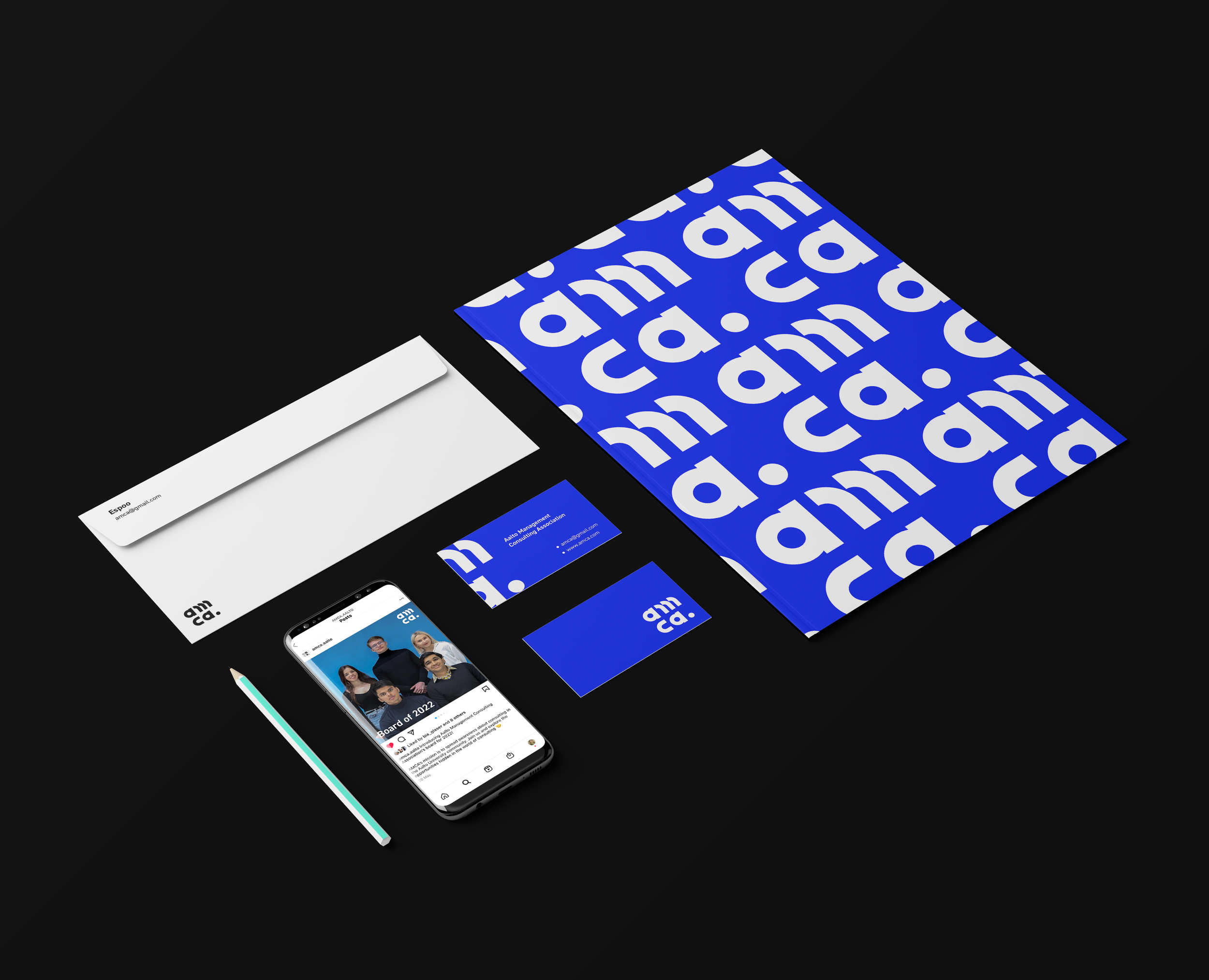
My goal was to create a logo and visual identity for AMCA. I find communication vital between the designer and client. I guided my fellow board members from the rough sketches to the final versions, listening to feedback along the way. These mid-presentations and exploration sessions helped me shape the visual identity of AMCA to be something the members could identify with.

Logo
AMCA’s logo was the most important step to begin with, as the logo is often the first visual mark that a consumer sees when coming across a brand or association. The rest of the details, such as typography and color come into focus later.
In my benchmark I researched the logos of similar student associations to AMCA, such as University of Toronto and Washington Consulting Association. I also looked through consulting companies to get a broader look of visual identities of consulting companies.
In AMCA’s moodboard I focused on feeling instead of competitors. How does the brand feel? What color is it? What adjectives describe its personality? I really fell for bright blues and bold logos, which could be described as playful, kind and smart. I strived to keep the moodboard harmonious, yet flexible to different directions so that the client(s) don’t feel stuck.

Branding Style Guide
My next task was to create a branding style guide. A branding style guide is a list of guidelines, which define the visual identity of a brand. It gets into the nitty gritty of logo sizing, file types, color combinations and typographic rules. This guide ensures that AMCA’s visual identity stays consistent and clean. It is crafted by the designer in a language understood by the client. The designer must leave the position at some point and it ensures that the logo is respected.
I listened to an interview about a designer who did not make a how-to guide for their logo. Five years later it was stretched out on a billboard with a terrible dropshadow, which made it almost unrecognizable. I never want to be in that situation. With the help of the style guide, my friend and AMCA’s head of IT, Rafal Ciechanski designed AMCA’s website. The typography, color combinations and logo gridding were done according to the style guide.

The image above displays page 5 of AMCA’s style guide: Color Combinations. This is a great example of how a set of rules can ease the life of the designer and client. As I created the color palette, I explored how the colors interact with one another. For example, is the typography legible against color x? How does it look reversed? Is it uncomfortably saturated? Documenting what works and what doesn’t provides the designer and client with a clear rulebook. Less confusion and repeated questions.

The Future of AMCA
As of meeting my teekkari friends (and future board members) in November 2021, AMCA has gotten off to a great start. We plan on having a kick-off event this fall. I wish that the visual identity of AMCA will gain recognition and further encourage students and collaborators to join us on our journey.

